# NativeFlow
> Utility style-objects for React Native — switch from Tailwind on web to NativeFlow on app with zero extra setup.
This file contains all documentation content in a single document following the llmstxt.org standard.
## 👋 Introduction
## Get working with NativeFlow
Hellow, we're NativeFlow, building a dependency-free approach, which builds from bottom up and gives you and your team a beter syntax to work around with.
We're glad to have you!
## Benefits we Offer?
- Closer to how stylesheets in React Native 'are meant to be'
- Objects instead of classes (literally **literals**)
- You can extend the library to your liking / build your own fork of NativeFlow
- Syntax similar to Tailwind so lesser learning curve
## Platform-specific symbols
- *✱* Android
- *★* iOS
## Similarities with Tailwind
- 'Almost' same utility names for objects
- Similar environment setup (custom prettier-plugin && Intellisense under development)
> Continue with [Installations](/docs/installations)
---
## Editor Setup
## VS Code Extension
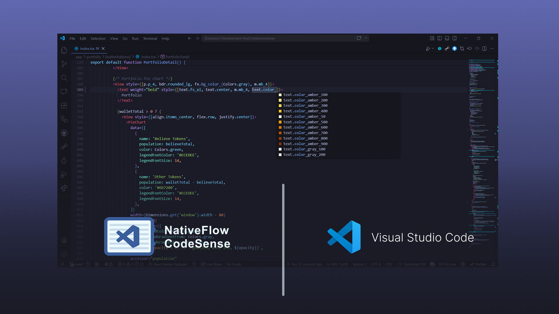
Install [NativeFlow CodeSense](https://marketplace.visualstudio.com/items?itemName=jayowiee.nativeflowcss-codesense) from the VS Code Marketplace, or build it from source in the [CodeSense GitHub repository](https://github.com/nativeflowteam/codesense).
It provides NativeFlow utility autocompletion, hover details, diagnostics, quick fixes, and color previews for JSX/TSX workflows.
## AI IDEs
NativeFlow publishes machine-readable documentation following the [llms.txt standard](https://llmstxt.org/) so AI editors and chat assistants (Cursor, Windsurf, Claude Code, Continue, GitHub Copilot Chat, etc.) can ground their answers in the real docs.
- [`https://nativeflow.js.org/llms.txt`](https://nativeflow.js.org/llms.txt) — curated index of every documentation page with one-line descriptions. Use this as a lightweight context file.
- [`https://nativeflow.js.org/llms-full.txt`](https://nativeflow.js.org/llms-full.txt) — the entire NativeFlow documentation concatenated into a single markdown file. Use this when you want the model to have full coverage in one shot.
### How to use it
In Cursor / Windsurf, add the URL as a custom doc source (`@Docs` → Add new doc) and reference it with `@NativeFlow` in chat. In Claude Code or any chat UI, paste the URL or download the file and attach it. Both files regenerate on every docs deploy, so they stay current.
---
## Installations
**Let's get working with NativeFlow, staying close to React-Native Fundamentals with concise syntax.**
**Zero dependency-approach, clean and minimal Javascript objects to make your life bug-free!**
## Installation
Install the npm package for NativeFlow classes
```bash title="terminal"
npm i nativeflowcss
```
## Imports
Add your desired UI classes from the library to be used in your project
> Checkout the [fundamentals](/docs/fundamentals#imports) page for the Ctrl + C - Ctrl + V stuff
```jsx title="src/components/Card.js"
```
## Babel && Prettier

You might've guessed by now, yep, dependency-free library! No extra setup required.
You can make your own deps if you want to have a customised workflow, sky's the limit.
:::info[automated imports]
A vs-code extension for automatically importing the classes is under progress, contribute to it on [NativeFlow - Intellisense repository](https://github.com/nativeflowteam/intellisense)
:::
---
## Syntax Difference
How is NativeFlow different from Tailwind (syntax-wise)
## Differences
There's usually a parent object which has sub-keys which spill the stylesheet object from the library
- Tailwind uses `-`, NativeFlow uses `_` for joining words
- Tailwind uses `[]`, NativeFlow uses `()` for taking custom value inputs
- You need to wrap your custom properties with `""` (for numbers, it works without strings as well)
- There's a minor `import` step you'll need to do manually (for now 😉), copy it from the [fundamentals](/docs/fundamentals) section
> Ex. `bdr.rounded_("33")`
## Why?
All these nuances are being done so that we can use objects.
JavaScript does not allow using hyphens (`-`), numbers (in the first position of key).
Also we can create a function as a key on the parent object which can spill stylesheet objects with custom values.
---
## Custom Styles
How to input your desired values for various utility style-objects.
## How to generate Custom Styles
- **Step 1**: Get the object you want to get custom generated and remove the value
- **Step 2**: Add `()` at the end of the the object ( using the function )
- **Step 3**: Give your desired input in the `string` format ( It also works with `number` so some properties )
### Example
We'll try using a custom background color, using `#ccc` instead of `slate_300`
- **Step 1**: `fx.bg_color_slate_300` ➜ `fx.bg_color_`
- **Step 2**: `fx. bg_color_()`
- **Step 3**: `fx.bg_color_("#ccc")`
:::tip
For a detailed description on How-To use custom styles for certain properties, checkout `#custom-property-values` section their specific docs
:::
---
## Destructured Approach
Reusing a stylesheet made using NativeFlow utility objects
Jay I don't wanna make my style property cluttered and use the good'ol `StyleSheet.create()`, is there any way to implement utility-objects in the stylesheet?
## Why Destructure
- More consistency in design systems
- Extended reusability (like a lot, really lot)
- Aren't these two points good enough make it smoother to use NativeFlow in big codebases?
## How-to Destructure
Javascript provides object destructring through the spread operator (`...someObject`), we can utilize it to implement utility objects in the `StyleSheet.create()` Native function
```js title="src/screens/LoginPage.js"
// Creating a custom container
const container = StyleSheet.create({
...p.x_12,
...m.y_6,
...align.items_center,
...justify.center,
});
```
---
## Flex vs Grow vs Shrink vs Basis
A comprehensive guide how elements expand to fill available space with various flex properties in React Native.
## Example code
## Extended Preview

## `flex: 0` (default)
### `flex: 0`
Element takes the size of contents. According to the [documentation](https://facebook.github.io/react-native/docs/layout-props.html#flexgrow) it should be sized by setting `width` and `height` props but it seems to fit to contents if those aren't set.
### `flex: 0, flexBasis: {{px}}`
Element takes the size given by `flexBasis`
### `flex: 0, flexGrow: 1`
With `flex: 0` and `flexGrow: 1;` it's the same as adding the size of the contents (in the example above it's a ) to the size of an element that's set to `flex: 1`. It's similar to `flex: 1, flexBasis: 10` except instead of adding a number of pixels you're adding the size of the content.
### `flex: 0, flexShrink: 1`
With `flex: 0` and `flexShrink: 1`, the element seems to take the size of the content, in other words it's the same as just `flex: 0`. I'll bet there are situations where it would be bigger than the content but I haven't see that yet.
### `flex: 0, flexGrow: 1, flexBasis: {{px}}`
This is the same as `flex: 0, flexGrow: 1` except instead of adding the content size to a `flex: 1` element it adds the given number of pixels.
### `flex: 0, flexShrink: 1, flexBasis: {{px}}`
This is the same as `flex: 0, flexBasis: {{px}}`.
### `flex: 0, height: {{px}}`
With `flex: 0`, `height` is treated just like `flexBasis`. If there is both a `height` and `flexBasis` are set, `height` is ignored.
## `flex: 1`
### `flex: 1`
Element takes available space. See Layout Props documentation for more details
### `flex: 1, flexBasis: {{px}}`
With `flex: 1 and flexBasis: {{px}};` the value of `flexBasis` is added to the element's size. In other words, it's like taking a `flex: 1` element and adding on the number of pixels set by `flexBasis`. So if a flex: 1 element is `50px`, and you add `flexBasis: 20` the element will now be `70px`.
### `flex: 1, flexGrow: 1`
ignored
### flex: 1, flexShrink: 1
ignored
### `flex: 1, flexGrow: 1, flexBasis: {{px}}`
This is the same as `flex: 1, flexBasis: {{px}}` since `flexGrow` is ignored.
### `flex: 1, flexShrink: 1, flexBasis: {{px}}`
This is the same as `flex: 1, flexBasis: {{px}}` since `flexShrink` is ignored.
### `flex: 1, height: {{px}}`
With `flex: 1`, `height` is ignored. Use `flexBasis` instead.
## Here are my observations:
- **Trouble Shooting Tip**: Make sure the parent view(s) are giving the children room to grow/shrink. Notice the `flex: 1` on the parent view, without it, all the children don't display as you'd expect.
- **Trouble Shooting Tip**: Don't use Hot Reloading when testing these values, it can display elements incorrectly after it's reloaded a few times. I recommend enabling Live Reload or using command/ctrl + r (a lot).
- The default flex value is `flex: 0`. If you don't add a flex style value it defaults to `0`.
- **Trouble Shooting Tip**: if you're trying to figure out why something isn't displaying like you think it should, start with the (most) parent element and make sure it's giving enough space to it's children to do what they need to do. In other words, try setting it to `flex:1` and see if that helps, then go to the next child and repeat.
- It seems like width is always considered with `flexDirection: "column"` no matter the other flex props. The same applies for height with `flexDirection: "row"`.
After running these test, in general I would use `flexBasis` over `height` since `flexBasis` trumps `height`.
> Reference: [StackOverflow Post](https://stackoverflow.com/questions/43143258/flex-vs-flexgrow-vs-flexshrink-vs-flexbasis-in-react-native)
---
## Utility-First Fundamentals
How the syntax system works, what flaws the other approach has that NativeFlow fixes
## Why NativeFlow ?
The regular way to write styles in a React Native project is primarily through stylesheet objects,
using properties a lot similar to the [CSS for Web](https://developer.mozilla.org/en-US/docs/Web/CSS)
but using the CSS-in-JS type of syntax.
The CSS-in-JS type of properties are verbose and take a bit of workaround to get running up due to newer namespaces, etc.
So while preserving the Native approach, we get up running with shorter syntax, with NativeFlow
**You can focus on the design, we'll make it quicker for you**
## We use utility-objects, not classes, but why?
- React Native was naturally meant to work around with stylesheet **objects** not classNames
- We forcefully started injecting tailwind with the help of babel which worked fine, but breaks sometimes, more than often
- The babel-injected approach also lacked animations and platform specific properties like `elevation` or `borderCurve`
- And why should we hassle if we can stay close to the environment
## Imports
The only 'caveat' in using NativeFlow is, uhh... *Imports*, these being style objects need to be manually imported from the library, You can keep referring this section for Iports until something tasty is being cooked 🍛
### Common Imports
```jsx
```
### Everything Imports
```jsx
```
---
## Aspect Ratio
Control width-to-height proportions of elements.
## Import
```js title="src/screens/Component.js"
```
## Properties
| Object | Native properties |
| ------------- | ------------------------- |
| aspect.auto | `{ aspectRatio: 'auto' }` |
| aspect.square | `{ aspectRatio: 1 }` |
| aspect.video | `{ aspectRatio: 16 / 9 }` |
## Custom Aspect Ratios
Custom properties are usually rendered using `_(customValue)`
| Object | Native Properties |
| ---------------------------- | ------------------------------ |
| aspect.custom_(customValue) | `{ aspectRatio: customValue }` |
---
## Direction
Set writing direction for layout flow.
## Import
```js title="src/screens/Component.js"
```
## Properties
| Object | Native properties |
| ----------------- | -------------------------- |
| direction.inherit | `{ direction: 'inherit' }` |
| direction.ltr | `{ direction: 'ltr' }` |
| direction.rtl | `{ direction: 'rtl' }` |
---
## Display
Set element display properties like hidden, flex.
## Import
```js title="src/screens/Component.js"
```
## Properties
| Object | Native properties |
| ------------- | ------------------------- |
| display.hidden | `{ display: 'none' }` |
| display.flex | `{ display: 'flex' }` |
---
## Object Fit
Define how content/images fits within containers.
## Import
```js title="src/screens/Component.js"
```
## Properties
| Object | Native properties |
| --------------------- | ----------------------------- |
| object_fit.cover | `{ resizeMode: 'cover' }` |
| object_fit.contain | `{ resizeMode: 'contain' }` |
| object_fit.stretch | `{ resizeMode: 'stretch' }` |
| object_fit.repeat | `{ resizeMode: 'repeat' }` |
| object_fit.center | `{ resizeMode: 'center' }` |
| object_fit.fill | `{ objectFit: 'fill' }` |
| object_fit.scale_down | `{ objectFit: 'scale_down' }` |
---
## Overflow
Control the visibility of content that overflows the boundaries of its container.
## Import
```js title="src/screens/Component.js"
```
## Properties
| Object | Native properties |
| ----------------- | ------------------------- |
| overflow.visible | `{ overflow: 'visible' }` |
| overflow.hidden | `{ overflow: 'hidden' }` |
---
## Position
Set absolute or relative positioning for elements.
## Import
```js title="src/screens/Component.js"
```
## Properties
| Object | Native properties |
| ---------------- | ---------------------------- |
| pos.relative | `{ position: 'relative' }` |
| pos.absolute | `{ position: 'absolute' }` |
| pos.fixed | `{ position: 'fixed' }` |
| pos.sticky | `{ position: 'sticky' }` |
---
## Top / Right / Bottom / Left
Control element offsets from any side.
## Import
```js title="src/screens/Component.js"
```
## Properties
Object
Native Properties
{`pos.t_px`}
{`{ top: 1 }`}
{`pos.r_px`}
{`{ right: 1 }`}
{`pos.b_px`}
{`{ bottom: 1 }`}
{`pos.l_px`}
{`{ left: 1 }`}
{Object.entries(valueList).map(([key, value]) => (
{`pos.t_${key}`}
{`{ top: ${value} }`}
{`pos.r_${key}`}
{`{ right: ${value} }`}
{`pos.b_${key}`}
{`{ bottom: ${value} }`}
{`pos.l_${key}`}
{`{ left: ${value} }`}
))}
## Custom Aspect Ratios
Custom properties are usually rendered using `_(customValue)`
| Object | Native Properties |
| -------------------- | ------------------------- |
| pos.t_(customValue) | `{ top: customValue }` |
| pos.r_(customValue) | `{ right: customValue }` |
| pos.b_(customValue) | `{ bottom: customValue }` |
| pos.l_(customValue) | `{ left: customValue }` |
---
## Z-Index
Manage stacking order of overlapping elements.
## Import
```js title="src/screens/Component.js"
```
## Properties
| Object | Native properties |
| ------------ | ----------------------- |
| z.index_auto | `{ zIndex: 'auto' }` |
| z.index_0 | `{ zIndex: 0 }` |
| z.index_10 | `{ zIndex: 10 }` |
| z.index_20 | `{ zIndex: 20 }` |
| z.index_30 | `{ zIndex: 30 }` |
| z.index_40 | `{ zIndex: 40 }` |
| z.index_50 | `{ zIndex: 50 }` |
## Custom Z-Index
Custom properties are usually rendered using `_(customValue)`
| Object | Native Properties |
| ------------------------ | ------------------------------ |
| z.index_(customValue) | `{ zIndex: customValue }` |
---
## Align Content
Distribute space among flex lines when wrapping.
## Import
```js title="src/screens/Component.js"
```
## Properties
| Object | Native properties |
| --------------------- | ----------------------------------- |
| align.content_center | `{ alignContent: 'center' }` |
| align.content_start | `{ alignContent: 'flex-start' }` |
| align.content_end | `{ alignContent: 'flex-end' }` |
| align.content_stretch | `{ alignContent: 'stretch' }` |
| align.content_between | `{ alignContent: 'space-between' }` |
| align.content_around | `{ alignContent: 'space-around' }` |
---
## Align Items
Align flex items along the cross axis.
## Import
```js title="src/screens/Component.js"
```
## Properties
| Object | Native properties |
| -------------------- | ------------------------------ |
| align.items_center | `{ alignItems: 'center' }` |
| align.items_start | `{ alignItems: 'flex-start' }` |
| align.items_end | `{ alignItems: 'flex-end' }` |
| align.items_baseline | `{ alignItems: 'baseline' }` |
| align.items_stretch | `{ alignItems: 'stretch' }` |
---
## Align Self
Override alignment for individual flex items.
## Import
```js title="src/screens/Component.js"
```
## Properties
| Object | Native properties |
| ------------------- | ----------------------------- |
| align.self_auto | `{ alignSelf: 'auto' }` |
| align.self_center | `{ alignSelf: 'center' }` |
| align.self_start | `{ alignSelf: 'flex-start' }` |
| align.self_end | `{ alignSelf: 'flex-end' }` |
| align.self_stretch | `{ alignSelf: 'stretch' }` |
| align.self_baseline | `{ alignSelf: 'baseline' }` |
---
## Flex Basis
Set initial size before elements grow or shrink.
## Import
```js title="src/screens/Component.js"
```
## Properties
Object
Native Properties
{`flex.basis_auto`}
{`{ flexBasis: 'auto' }`}
{`flex.basis_px`}
{`{ flexBasis: 1 }`}
{Object.entries(valueList).map(([key, value]) => (
{`flex.basis_${key}`}
{`{ flexBasis: ${value} }`}
))}
## Custom Flex Basis
Custom properties are usually rendered using `_(customValue)`
> For `flexBasis` input type is `number`, except 'auto' being the only `string` input
| Object | Native Properties |
| -------------------- | ------------------------- |
| flex.basis_(customValue) | `{ flaxBasis: customValue }` |
---
## Flex Direction
Define the direction of flex container items.
## Properties
| Classes | Native Props |
| ------------------- | ------------------------------------- |
| flex.row | `{ flexDirection: 'row' }` |
| flex.row_reverse | `{ flexDirection: 'row-reverse' }` |
| flex.col | `{ flexDirection: 'column' }` |
| flex.column_reverse | `{ flexDirection: 'column-reverse' }` |
---
## Flex Grow
Control how elements expand to fill available space.
## Import
```js title="src/screens/Component.js"
```
## Properties
| Object | Native properties |
| --------- | ----------------- |
| flex.grow | `{ flexGrow: 1 }` |
| flex.grow_0 | `{ flexGrow: 0 }` |
---
## Flex Shrink
Control how elements shrink when space is limited.
## Import
```js title="src/screens/Component.js"
```
## Properties
| Object | Native properties |
| ------------- | ------------------- |
| flex.shrink | `{ flexShrink: 1 }` |
| flex.shrink_0 | `{ flexShrink: 0 }` |
---
## Flex Wrap
Define the wrap of flex container items.
## Import
```js title="src/screens/Component.js"
```
## Properties
| Classes | Native Props |
| ------------------- | ------------------------------ |
| `flex.wrap` | `{ flexWrap: 'wrap' }` |
| `flex.wrap_reverse` | `{ flexWrap: 'wrap-reverse' }` |
| `flex.nowrap` | `{ flexWrap: 'nowrap' }` |
---
## Flex
Define how flex subdivides for elements.
## Properties
| Classes | Native Props |
| ---------- | ------------- |
| `flex.f_1` | `{ flex: 1 }` |
| `flex.f_2` | `{ flex: 2 }` |
| `flex.f_3` | `{ flex: 3 }` |
| `flex.f_4` | `{ flex: 4 }` |
| `flex.f_5` | `{ flex: 5 }` |
| `flex.f_6` | `{ flex: 6 }` |
| `flex.f_7` | `{ flex: 7 }` |
| `flex.f_8` | `{ flex: 8 }` |
| `flex.f_9` | `{ flex: 9 }` |
## Custom Flex
Custom properties are usually rendered using `_(customValue)`
| Object | Native Properties |
| --------------------- | ----------------------- |
| flex.f_(customValue) | `{ flex: customValue }` |
---
## Gap
Manage spacing between flex items.
## Import
```js title="src/screens/Component.js"
```
## Properties
Object
Native Properties
{Object.entries(valueList).map(([key, value]) => (
{`flex.gap_${key}`}
{`{ gap: ${value} }`}
{`flex.gap_x_${key}`}
{`{ rowGap: ${value} }`}
{`flex.gap_y_${key}`}
{`{ columnGap: ${value} }`}
))}
## Custom Flex Basis
Custom properties are usually rendered using `_(customValue)`
| Object | Native Properties |
| ------------------------ | ---------------------------- |
| flex.gap_(customValue) | `{ gap: customValue }` |
| flex.gap_x_(customValue) | `{ rowGap: customValue }` |
| flex.gap_y_(customValue) | `{ columnGap: customValue }` |
---
## Justify Content
Distribute space and align items along the main axis.
## Import
```js title="src/screens/Component.js"
```
## Properties
| Object | Native properties |
| --------------- | ------------------------------------- |
| justify.center | `{ justifyContent: 'center' }` |
| justify.start | `{ justifyContent: 'flex-start' }` |
| justify.end | `{ justifyContent: 'flex-end' }` |
| justify.between | `{ justifyContent: 'space-between' }` |
| justify.around | `{ justifyContent: 'space-around' }` |
| justify.evenly | `{ justifyContent: 'space-evenly' }` |
:::info
`justifySelf` is not a React Native property, checkout the workaround with it on the next page
:::
---
## Justify Self ❔
Custom alignment for individual items (Native workaround for the CSS equivalent).
## How
Adding `flexDirection` to a component's style determines the **primary axis** of its layout.
Adding `alignItems` to a component's style determines the alignment of children
along the **secondary axis** (if the primary axis is row, then the secondary is column, and vice versa).
## Workaround
## Summary
So the best solution is two wrap the element which you want to apply `justifySelf` with a `` component
and apply `flexDirection` to the parent and get the desired alignment using `align` or `justify`.
> Reference: [Stackoverflow post](https://stackoverflow.com/questions/50847577/why-does-react-native-not-offer-a-justify-self)
---
## Place Items
Align and justify items within a container.
## Import
```js title="src/screens/Component.js"
```
## Properties
| Object | Native properties |
| ------------------- | -------------------------------------------------------------------- |
| place.items_center | `{ alignItems: 'center'`, `justifyContent: 'center' }` |
| place.items_stretch | `{ alignItems: 'stretch'`, `justifyContent: 'stretch' }` |
| place.items_start | `{ alignItems: 'flex-start'`, `justifyContent: 'flex-start' }` |
| place.items_end | `{ alignItems: 'flex-end'`, `justifyContent: 'flex-end' }` |
| place.items_between | `{ alignItems: 'center'`, `justifyContent: 'space-between' }` |
| place.items_around | `{ alignItems: 'center'`, `justifyContent: 'space-around' }` |
| place.items_evenly | `{ alignItems: 'center'`, `justifyContent: 'space-evenly' }` |
---
## Margin
Spacing outside element's border.
## Import
```js title="src/screens/Component.js"
```
## Properties
Object
Native Properties
{`m.m_px`}
{`{ margin: 1 }`}
{`m.mx_px`}
{`{ marginLeft: 1, marginRight: 1 }`}
{`m.my_px`}
{`{ marginTop: 1, marginBottom: 1 }`}
{`m.mt_px`}
{`{ marginTop: 1 }`}
{`m.mb_px`}
{`{ marginBottom: 1 }`}
{`m.mr_px`}
{`{ marginRight: 1 }`}
{`m.ml_px`}
{`{ marginLeft: 1 }`}
{`m.ms_px`}
{`{ marginStart: 1 }`}
{`m.me_px`}
{`{ marginEnd: 1 }`}
{Object.entries(valueList).map(([key, value]) => (
{`m.m_${key}`}
{`{ margin: ${value} }`}
{`m.mx_${key}`}
{`{ marginLeft: ${value}, marginRight: ${value} }`}
{`m.my_${key}`}
{`{ marginTop: ${value}, marginBottom: ${value} }`}
{`m.mt_${key}`}
{`{ marginTop: ${value} }`}
{`m.mb_${key}`}
{`{ marginBottom: ${value} }`}
{`m.mr_${key}`}
{`{ marginRight: ${value} }`}
{`m.ml_${key}`}
{`{ marginLeft: ${value} }`}
{`m.ms_${key}`}
{`{ marginStart: ${value} }`}
{`m.me_${key}`}
{`{ marginEnd: ${value} }`}
))}
## Custom Margins
Custom properties are rendered using `_(customValue)`.
`m.m_(...)` accepts exactly 1, 2, or 4 values.
> Margin in React Native only supports the default `unitless` values (auto, fit-content, max-content, full)
> To use custom negative margins, pass negative numbers directly (for example, `m.m_(-8)`).
| Object | Native Properties |
| -------------------------- | --------------------------------------------------------------------- |
| m.m_(customValue) | `{ margin: customValue }` |
| m.m_(vertical, horizontal) | `{ marginVertical: vertical, marginHorizontal: horizontal }` |
| m.m_(top, right, bottom, left) | `{ marginTop: top, marginRight: right, marginBottom: bottom, marginLeft: left }` |
| m.mx_(customValue) | `{ marginLeft: customValue, marginRight: customValue }` |
| m.my_(customValue) | `{ marginTop: customValue, marginBottom: customValue }` |
| m.mt_(customValue) | `{ marginTop: customValue }` |
| m.mb_(customValue) | `{ marginBottom: customValue }` |
| m.mr_(customValue) | `{ marginRight: customValue }` |
| m.ml_(customValue) | `{ marginLeft: customValue }` |
| m.ms_(customValue) | `{ marginStart: customValue }` |
| m.me_(customValue) | `{ marginEnd: customValue }` |
---
## Padding
Spacing inside element's border.
## Import
```js title="src/screens/Component.js"
```
## Properties
Object
Native Properties
{`p.p_px`}
{`{ padding: 1 }`}
{`p.px_px`}
{`{ paddingLeft: 1, paddingRight: 1 }`}
{`p.py_px`}
{`{ paddingTop: 1, paddingBottom: 1 }`}
{`p.pt_px`}
{`{ paddingTop: 1 }`}
{`p.pb_px`}
{`{ paddingBottom: 1 }`}
{`p.pr_px`}
{`{ paddingRight: 1 }`}
{`p.pl_px`}
{`{ paddingLeft: 1 }`}
{`p.ps_px`}
{`{ paddingStart: 1 }`}
{`p.pe_px`}
{`{ paddingEnd: 1 }`}
{Object.entries(valueList).map(([key, value]) => (
{`p.p_${key}`}
{`{ padding: ${value} }`}
{`p.px_${key}`}
{`{ paddingLeft: ${value}, paddingRight: ${value} }`}
{`p.py_${key}`}
{`{ paddingTop: ${value}, paddingBottom: ${value} }`}
{`p.pt_${key}`}
{`{ paddingTop: ${value} }`}
{`p.pb_${key}`}
{`{ paddingBottom: ${value} }`}
{`p.pr_${key}`}
{`{ paddingRight: ${value} }`}
{`p.pl_${key}`}
{`{ paddingLeft: ${value} }`}
{`p.ps_${key}`}
{`{ paddingStart: ${value} }`}
{`p.pe_${key}`}
{`{ paddingEnd: ${value} }`}
))}
## Custom Padding
Custom properties are rendered using `_(customValue)`.
`p.p_(...)` accepts exactly 1, 2, or 4 values.
> Padding in React Native only supports the default `unitless` values (auto, fit-content, max-content, full)
| Object | Native Properties |
| -------------------------- | ------------------------------------------------------------------------ |
| p.p_(customValue) | `{ padding: customValue }` |
| p.p_(vertical, horizontal) | `{ paddingVertical: vertical, paddingHorizontal: horizontal }` |
| p.p_(top, right, bottom, left) | `{ paddingTop: top, paddingRight: right, paddingBottom: bottom, paddingLeft: left }` |
| p.px_(customValue) | `{ paddingLeft: customValue, paddingRight: customValue }` |
| p.py_(customValue) | `{ paddingTop: customValue, paddingBottom: customValue }` |
| p.pt_(customValue) | `{ paddingTop: customValue }` |
| p.pb_(customValue) | `{ paddingBottom: customValue }` |
| p.pr_(customValue) | `{ paddingRight: customValue }` |
| p.pl_(customValue) | `{ paddingLeft: customValue }` |
| p.ps_(customValue) | `{ paddingStart: customValue }` |
| p.pe_(customValue) | `{ paddingEnd: customValue }` |
---
## Height
Control the height of elements.
## Import
```js title="src/screens/Component.js"
```
## Properties
Object
Native Properties
{Object.entries(valueList).map(([key, value]) => (
{`h.h_${key}`}
{`{ height: ${value} }`}
))}
## Custom Heights
Custom properties are usually rendered using `_(customValue)`
> Height in React Native does not support `%` unit as of now
| Object | Native Properties |
| ---------------------------- | ------------------------------ |
| h.w_(customValue) | `{ height: customValue }` |
---
## Max Height
Limit the maximum height of elements.
## Import
```js title="src/screens/Component.js"
```
## Properties
Object
Native Properties
{Object.entries(valueList).map(([key, value]) => (
{`h.max_${key}`}
{`{ maxHeight: ${value} }`}
))}
## Custom Max Heights
Custom properties are usually rendered using `_(customValue)`
> Max Height in React Native does not support `%` unit as of now
| Object | Native Properties |
| ------------------ | ------------------------ |
| h.max_(customValue) | `{ maxHeight: customValue }` |
---
## Max Width
Limit the maximum width of elements.
## Import
```js title="src/screens/Component.js"
```
## Properties
Object
Native Properties
{Object.entries(valueList).map(([key, value]) => (
{`w.max_${key}`}
{`{ maxWidth: ${value} }`}
))}
## Custom Max Widths
Custom properties are usually rendered using `_(customValue)`
> Max Width in React Native does not support `%` unit as of now
| Object | Native Properties |
| ------------------ | ------------------------ |
| w.max_(customValue) | `{ maxWidth: customValue }` |
---
## Min Height
Define the minimum height an element can have.
## Import
```js title="src/screens/Component.js"
```
## Properties
Object
Native Properties
{Object.entries(valueList).map(([key, value]) => (
{`h.min_${key}`}
{`{ minHeight: ${value} }`}
))}
## Custom Min Heights
Custom properties are usually rendered using `_(customValue)`
> Min Height in React Native does not support `%` unit as of now
| Object | Native Properties |
| ------------------ | ------------------------ |
| h.min_(customValue) | `{ minHeight: customValue }` |
---
## Min Width
Define the minimum width an element can have.
## Import
```js title="src/screens/Component.js"
```
## Properties
Object
Native Properties
{Object.entries(valueList).map(([key, value]) => (
{`w.min_${key}`}
{`{ minWidth: ${value} }`}
))}
## Custom Min Widths
Custom properties are usually rendered using `_(customValue)`
> Min Width in React Native does not support `%` unit as of now
| Object | Native Properties |
| ------------------ | ------------------------ |
| w.min_(customValue) | `{ minWidth: customValue }` |
---
## Size
Create square-shaped elements with equal width and height.
## Import
```js title="src/screens/Component.js"
```
## Properties
Object
Native Properties
{Object.entries(valueList).map(([key, value]) => (
{`size.s_${key}`}
{`{ width: ${value}, height: ${value} }`}
))}
## Custom Sizes
Custom properties are usually rendered using `_(customValue)`
> Size in React Native does not support `%` unit as of now
| Object | Native Properties |
| ------------------ | ------------------------ |
| size.s_(customValue) | `{ width: customValue, height: customValue }` |
---
## Width
Control the width of elements.
## Import
```js title="src/screens/Component.js"
```
## Properties
Object
Native Properties
{Object.entries(valueList).map(([key, value]) => (
{`w.w_${key}`}
{`{ width: ${value} }`}
))}
## Custom Widths
Custom properties are usually rendered using `_(customValue)`
> Width in React Native does not support `%` unit as of now
| Object | Native Properties |
| ------------------ | ------------------------ |
| w.w_(customValue) | `{ width: customValue }` |
---
## Font Family
Define the font family for text.
## Import
```js title="src/screens/Component.js"
```
## Properties
| Object | Native Properties |
| --------------------- | ------------------------------- |
| text.font_family(path) | `{ fontFamily: path }` |
## Usage
To use a custom font family, pass the font path as a string to the `font_family` function.
```js title="src/screens/Component.js"
const CustomFontComponent = () => {
return (
This text uses the Libre Franklin font.
);
};
export default CustomFontComponent;
```
---
## Font Size
Adjust the size of the text.
## Import
```js title="src/screens/Component.js"
```
## Properties
| Object | Native Properties |
| ------------ | ------------------------------- |
| text.fs_xs | `{ fontSize: 12, lineHeight: 16 }` |
| text.fs_sm | `{ fontSize: 14, lineHeight: 20 }` |
| text.fs_base | `{ fontSize: 16, lineHeight: 24 }` |
| text.fs_lg | `{ fontSize: 18, lineHeight: 28 }` |
| text.fs_xl | `{ fontSize: 20, lineHeight: 28 }` |
| text.fs_2xl | `{ fontSize: 24, lineHeight: 32 }` |
| text.fs_3xl | `{ fontSize: 30, lineHeight: 36 }` |
| text.fs_4xl | `{ fontSize: 36, lineHeight: 40 }` |
| text.fs_5xl | `{ fontSize: 48, lineHeight: 48 }` |
| text.fs_6xl | `{ fontSize: 60, lineHeight: 60 }` |
| text.fs_7xl | `{ fontSize: 72, lineHeight: 72 }` |
| text.fs_8xl | `{ fontSize: 96, lineHeight: 96 }` |
| text.fs_9xl | `{ fontSize: 128, lineHeight: 128 }` |
---
## Font Style
Set text to normal or italic styles.
## Import
```js title="src/screens/Component.js"
```
## Properties
| Object | Native Properties | Style Text |
| --------------- | ------------------------- | -------------------------------------------------------------------------------------------------- |
| text.italic | `{ fontStyle: "italic" }` | Aa |
| text.non_italic | `{ fontStyle: "normal" }` | Aa |
---
## Font Weight
Control the thickness or boldness of text.
## Import
```js title="src/screens/Component.js"
```
## Properties
| Object | Native Properties |
| ------------------ | ----------------------- |
| text.fw_thin | `{ fontWeight: '100' }` |
| text.fw_extralight | `{ fontWeight: '200' }` |
| text.fw_light | `{ fontWeight: '300' }` |
| text.fw_normal | `{ fontWeight: '400' }` |
| text.fw_medium | `{ fontWeight: '500' }` |
| text.fw_semibold | `{ fontWeight: '600' }` |
| text.fw_bold | `{ fontWeight: '700' }` |
| text.fw_extrabold | `{ fontWeight: '800' }` |
| text.fw_black | `{ fontWeight: '900' }` |
---
## Letter Spacing
Adjust spacing between characters in text.
## Import
```js title="src/screens/Component.js"
```
## Properties
| Object | Native Properties |
| --------------------- | -------------------------------- |
| text.tracking_tighter | `{ letterSpacing: -2 }` |
| text.tracking_tight | `{ letterSpacing: -1 }` |
| text.tracking_normal | `{ letterSpacing: 0 }` |
| text.tracking_wide | `{ letterSpacing: 1 }` |
| text.tracking_wider | `{ letterSpacing: 2 }` |
| text.tracking_widest | `{ letterSpacing: 3 }` |
---
## Text Align
Align text horizontally within its container.
## Import
```js title="src/screens/Component.js"
```
## Properties
| Object | Native properties |
| ------------ | -------------------------- |
| text.auto | `{ textAlign: 'auto' }` |
| text.left | `{ textAlign: 'left' }` |
| text.right | `{ textAlign: 'right' }` |
| text.center | `{ textAlign: 'center' }` |
| text.justify | `{ textAlign: 'justify' }` |
---
## Text Color
Set the color of text.
## Import
```js title="src/screens/Component.js"
```
## Properties
Object
Native Properties
Color Text
{Object.entries(colorList).map(([key, value]) => (
{`text.color_${key}`}
{`{ color: '${value}' }`}
Aa
))}
## Custom Text Colors
Custom properties are usually rendered using `_(customValue)`
| Object | Native Properties |
| ------------------------ | ------------------------------ |
| text.color_(customColor) | `{ color: customColor }` |
## Colors
### Red Green Blue (RGB)
React Native supports rgb() and rgba() in both hexadecimal and functional notation:
- `'#f0f'` (#rgb)
- `'#ff00ff'` (#rrggbb)
- `'#f0ff'` (#rgba)
- `'#ff00ff00'` (#rrggbbaa)
- `'rgb(255, 0, 255)'`
- `'rgb(255 0 255)'`
- `'rgba(255, 0, 255, 1.0)'`
- `'rgba(255 0 255 / 1.0)'`
### Hue Saturation Lightness (HSL)
React Native supports hsl() and hsla() in functional notation:
- `'hsl(360, 100%, 100%)'`
- `'hsl(360 100% 100%)'`
- `'hsla(360, 100%, 100%, 1.0)'`
- `'hsla(360 100% 100% / 1.0)'`
### Hue Whiteness Blackness (HWB)
React Native supports hwb() in functional notation:
- `'hwb(0, 0%, 100%)'`
- `'hwb(360, 100%, 100%)'`
- `'hwb(0 0% 0%)'`
- `'hwb(70 50% 0%)'`
### Color ints
React Native supports also colors as an int values (in RGB color mode):
- `0xff00ff00` (0xrrggbbaa)
:::caution CAUTION
This action is dangerous
This might appear similar to the Android Color ints representation but on Android values are stored in SRGB color mode `(0xaarrggbb)`.
:::
### Named Colors
All colors from the [CSS3/SVG Specs](https://www.w3.org/TR/css-color-3/#svg-color) are supported.
> They only support lowercase named colors
---
## Text Decoration Color
Set the color of text decorations.
## Import
```js title="src/screens/Component.js"
```
## Properties
Object
Native Properties
Color Box
{Object.entries(colorList).map(([key, value]) => (
{`decoration.color_${key}`}
{`{ textDecorationColor: '${value}' }`}
colourful underline
))}
## Custom Overlay Colors
Custom properties are usually rendered using `_(customValue)`
| Object | Native Properties |
| ------------------------- | ---------------------------------- |
| decoration.color_(customColor) | `{ textDecorationColor: customColor }` |
## Colors
### Red Green Blue (RGB)
React Native supports rgb() and rgba() in both hexadecimal and functional notation:
- `'#f0f'` (#rgb)
- `'#ff00ff'` (#rrggbb)
- `'#f0ff'` (#rgba)
- `'#ff00ff00'` (#rrggbbaa)
- `'rgb(255, 0, 255)'`
- `'rgb(255 0 255)'`
- `'rgba(255, 0, 255, 1.0)'`
- `'rgba(255 0 255 / 1.0)'`
### Hue Saturation Lightness (HSL)
React Native supports hsl() and hsla() in functional notation:
- `'hsl(360, 100%, 100%)'`
- `'hsl(360 100% 100%)'`
- `'hsla(360, 100%, 100%, 1.0)'`
- `'hsla(360 100% 100% / 1.0)'`
### Hue Whiteness Blackness (HWB)
React Native supports hwb() in functional notation:
- `'hwb(0, 0%, 100%)'`
- `'hwb(360, 100%, 100%)'`
- `'hwb(0 0% 0%)'`
- `'hwb(70 50% 0%)'`
### Color ints
React Native supports also colors as an int values (in RGB color mode):
- `0xff00ff00` (0xrrggbbaa)
:::caution CAUTION
This action is dangerous
This might appear similar to the Android Color ints representation but on Android values are stored in SRGB color mode `(0xaarrggbb)`.
:::
### Named Colors
All colors from the [CSS3/SVG Specs](https://www.w3.org/TR/css-color-3/#svg-color) are supported.
> They only support lowercase named colors
---
## Text Decoration Lines
Apply underlines, overlines, or strikethroughs.
## Import
```js title="src/screens/Component.js"
```
## Properties
| Object | Native properties | Text Lines |
| --------------------------------- | -------------------------------------------------- | ---------- |
| decoration.underline | `{ textDecorationLine: 'underline' }` | Aa |
| decoration.line_through | `{ textDecorationLine: 'line-through' }` | Aa |
| decoration.underline_line_through | `{ textDecorationLine: 'underline line-through' }` | Aa |
| decoration.none | `{ textDecorationLine: 'none' }` | Aa |
---
## Text Decoration Style ★
Apply underlines, overlines, or strikethroughs.
>★ represents it's an iOS-only prop
## Import
```js title="src/screens/Component.js"
```
## Properties
| Classes | Native Props | Pattern Box |
| ------------------- | ----------------------------------- | --------------------------------------------------------------------------------------------------------------------------------------- |
| `decoration.solid` | `{ textDecorationStyle: "solid" }` | solid |
| `decoration.dotted` | `{ textDecorationStyle: "dotted" }` | dotted |
| `decoration.dashed` | `{ textDecorationStyle: "dashed" }` | dashed |
| `decoration.double` | `{ textDecorationStyle: "double" }` | double |
---
## Text Shadow Color ★
Set the color of the text shadow.
>★ represents it's an iOS-only prop
## Import
```js title="src/screens/Component.js"
```
## Properties
Object
Native Properties
Color Box
{Object.entries(colorList).map(([key, value]) => (
{`text.shadow_color_${key}`}
{`{ textShadowColor: '${value}' }`}
Aa
))}
## Custom Shadow Colors
Custom properties are usually rendered using `_(customValue)`
| Object | Native Properties |
| -------------------------------- | -------------------------------------- |
| text.shadow_color_(customColor) | `{ textShadowColor: customColor }` |
## Colors
### Red Green Blue (RGB)
React Native supports rgb() and rgba() in both hexadecimal and functional notation:
- `'#f0f'` (#rgb)
- `'#ff00ff'` (#rrggbb)
- `'#f0ff'` (#rgba)
- `'#ff00ff00'` (#rrggbbaa)
- `'rgb(255, 0, 255)'`
- `'rgb(255 0 255)'`
- `'rgba(255, 0, 255, 1.0)'`
- `'rgba(255 0 255 / 1.0)'`
### Hue Saturation Lightness (HSL)
React Native supports hsl() and hsla() in functional notation:
- `'hsl(360, 100%, 100%)'`
- `'hsl(360 100% 100%)'`
- `'hsla(360, 100%, 100%, 1.0)'`
- `'hsla(360 100% 100% / 1.0)'`
### Hue Whiteness Blackness (HWB)
React Native supports hwb() in functional notation:
- `'hwb(0, 0%, 100%)'`
- `'hwb(360, 100%, 100%)'`
- `'hwb(0 0% 0%)'`
- `'hwb(70 50% 0%)'`
### Color ints
React Native supports also colors as an int values (in RGB color mode):
- `0xff00ff00` (0xrrggbbaa)
:::caution CAUTION
This action is dangerous
This might appear similar to the Android Color ints representation but on Android values are stored in SRGB color mode `(0xaarrggbb)`.
:::
### Named Colors
All colors from the [CSS3/SVG Specs](https://www.w3.org/TR/css-color-3/#svg-color) are supported.
> They only support lowercase named colors
---
## Text Shadow Offset
Adjust the horizontal and vertical position of the shadow.
## Import
```js title="src/screens/Component.js"
```
## Properties
Object
Native Properties
{[...Array(24).keys()].map((i) => (
{`text.shadow_offset_${i + 1}`}
{`{ textShadowOffset: { width: ${i + 1}, height: ${i + 1} } }`}
))}
## Custom Shadow Offsets
Custom properties are usually rendered using `_(customValue)`
| Object | Native Properties |
| ------------------------------------------ | ---------------------------------------------------------------- |
| text.shadow_offset_(w, h) | `{ textShadowOffset: { width: w, height: h } }` |
---
## Text Shadow Radius
Define the blur radius of the text shadow.
## Import
```js title="src/screens/Component.js"
```
## Properties
Object
Native Properties
{[...Array(24).keys()].map((i) => (
{`text.shadow_radius_${i + 1}`}
{`{ textShadowRadius: ${i + 1} }`}
))}
## Custom Shadow Opacity
Custom properties are usually rendered using `_(customValue)`
| Object | Native Properties |
| -------------------------------- | ----------------------------------- |
| text.shadow_radius_(customValue) | `{ textShadowRadius: customValue }` |
---
## Text Transforms
Change text case to uppercase, lowercase, or capitalize.
## Import
```js title="src/screens/Component.js"
```
## Properties
| Object | Native properties | Example Text |
| ------------------------- | ---------------------------------------- | ------------ |
| text.none | `{ textTransform: 'none' }` | Aa |
| text.uppercase | `{ textTransform: 'uppercase' }` | Aa |
| text.lowercase | `{ textTransform: 'lowercase' }` | Aa |
| text.capitalize | `{ textTransform: 'capitalize' }` | Aa |
---
## Text Variants
Control typographic variants like small-caps or numbers.
## Import
```js title="src/screens/Component.js"
```
## Properties
| Object | Native properties | Example Text |
| ----------------- | -------------------------------------- | --------------------------------------------------------------- |
| text.smallcaps | `{ fontVariant: "small-caps" }` | Aa123 |
| text.oldstyle | `{ fontVariant: "oldstyle-nums" }` | Aa123 |
| text.lining | `{ fontVariant: "lining-nums" }` | Aa123 |
| text.tabular | `{ fontVariant: "tabular-nums" }` | Aa123 |
| text.proportional | `{ fontVariant: "proportional-nums" }` | Aa123 |
---
## User Select
Control the user selection behavior of text.
## Import
```js title="src/screens/Component.js"
```
## Properties
| Object | Native properties | Example Text |
| ------------------- | --------------------------- | ------------------------------------------------------------------------ |
| text.select_auto | `{ userSelect: "auto" }` | Selectable Text |
| text.select_text | `{ userSelect: "text" }` | Selectable Text |
| text.select_none | `{ userSelect: "none" }` | Non-selectable Text |
| text.select_contain | `{ userSelect: "contain" }` | Contained Selectable Text |
| text.select_all | `{ userSelect: "all" }` | All Selectable Text |
---
## Border Color
Apply colors to element borders.
## Import
```js title="src/screens/Component.js"
```
## Properties
Object
Native Properties
Color Box
{Object.entries(colorList).map(([key, value]) => (
{`bdr.color_${key}`}
{`{ borderColor: '${value}' }`}
{`bdr.b_color_${key}`}
{`{ borderBottomColor: '${value}' }`}
{`bdr.l_color_${key}`}
{`{ borderLeftColor: '${value}' }`}
{`bdr.r_color_${key}`}
{`{ borderRightColor: '${value}' }`}
{`bdr.t_color_${key}`}
{`{ borderTopColor: '${value}' }`}
{`bdr.s_color_${key}`}
{`{ borderStartColor: '${value}' }`}
{`bdr.e_color_${key}`}
{`{ borderEndColor: '${value}' }`}
))}
## Custom Border Colors
Custom properties are usually rendered using `_(customValue)`
| Object | Native Properties |
| ------------------------ | ------------------------------ |
| bdr.color_(customColor) | `{ borderColor: customColor }` |
| bdr.b_color_(customColor) | `{ borderBottomColor: customColor }` |
| bdr.l_color_(customColor) | `{ borderLeftColor: customColor }` |
| bdr.r_color_(customColor) | `{ borderRightColor: customColor }` |
| bdr.t_color_(customColor) | `{ borderTopColor: customColor }` |
| bdr.s_color_(customColor) | `{ borderStartColor: customColor }` |
| bdr.e_color_(customColor) | `{ borderEndColor: customColor }` |
## Colors
### Red Green Blue (RGB)
React Native supports rgb() and rgba() in both hexadecimal and functional notation:
- `'#f0f'` (#rgb)
- `'#ff00ff'` (#rrggbb)
- `'#f0ff'` (#rgba)
- `'#ff00ff00'` (#rrggbbaa)
- `'rgb(255, 0, 255)'`
- `'rgb(255 0 255)'`
- `'rgba(255, 0, 255, 1.0)'`
- `'rgba(255 0 255 / 1.0)'`
### Hue Saturation Lightness (HSL)
React Native supports hsl() and hsla() in functional notation:
- `'hsl(360, 100%, 100%)'`
- `'hsl(360 100% 100%)'`
- `'hsla(360, 100%, 100%, 1.0)'`
- `'hsla(360 100% 100% / 1.0)'`
### Hue Whiteness Blackness (HWB)
React Native supports hwb() in functional notation:
- `'hwb(0, 0%, 100%)'`
- `'hwb(360, 100%, 100%)'`
- `'hwb(0 0% 0%)'`
- `'hwb(70 50% 0%)'`
### Color ints
React Native supports also colors as an int values (in RGB color mode):
- `0xff00ff00` (0xrrggbbaa)
:::caution CAUTION
This action is dangerous
This might appear similar to the Android Color ints representation but on Android values are stored in SRGB color mode `(0xaarrggbb)`.
:::
### Named Colors
All colors from the [CSS3/SVG Specs](https://www.w3.org/TR/css-color-3/#svg-color) are supported.
> They only support lowercase named colors
---
## Border Radius
Set rounded corners with customizable radii.
## Import
```js title="src/screens/SplashScreen.js"
```
## Properties
| Object | Native Properties |
| ------------------- | --------------------------------------------------------------------------- |
| bdr.rounded_none | `{ borderRadius: 0 }` |
| bdr.rounded_sm | `{ borderRadius: 2 }` |
| bdr.rounded | `{ borderRadius: 4 }` |
| bdr.rounded_md | `{ borderRadius: 6 }` |
| bdr.rounded_lg | `{ borderRadius: 8 }` |
| bdr.rounded_xl | `{ borderRadius: 12 }` |
| bdr.rounded_2xl | `{ borderRadius: 16 }` |
| bdr.rounded_3xl | `{ borderRadius: 24 }` |
| bdr.rounded_full | `{ borderRadius: 9999 }` |
| bdr.rounded_s_none | `{ borderStartStartRadius: 0` , `borderEndStartRadius: 0 }` |
| bdr.rounded_s_sm | `{ borderStartStartRadius: 2` , `borderEndStartRadius: 2 }` |
| bdr.rounded_s | `{ borderStartStartRadius: 4` , `borderEndStartRadius: 4 }` |
| bdr.rounded_s_md | `{ borderStartStartRadius: 6` , `borderEndStartRadius: 6 }` |
| bdr.rounded_s_lg | `{ borderStartStartRadius: 8` , `borderEndStartRadius: 8 }` |
| bdr.rounded_s_xl | `{ borderStartStartRadius: 12` , `borderEndStartRadius: 12 }` |
| bdr.rounded_s_2xl | `{ borderStartStartRadius: 16` , `borderEndStartRadius: 16 }` |
| bdr.rounded_s_3xl | `{ borderStartStartRadius: 24` , `borderEndStartRadius: 24 }` |
| bdr.rounded_s_full | `{ borderStartStartRadius: 9999` , `borderEndStartRadius: 9999 }` |
| bdr.rounded_e_none | `{ borderStartEndRadius: 0` , `borderEndEndRadius: 0 }` |
| bdr.rounded_e_sm | `{ borderStartEndRadius: 2` , `borderEndEndRadius: 2 }` |
| bdr.rounded_e | `{ borderStartEndRadius: 4` , `borderEndEndRadius: 4 }` |
| bdr.rounded_e_md | `{ borderStartEndRadius: 6` , `borderEndEndRadius: 6 }` |
| bdr.rounded_e_lg | `{ borderStartEndRadius: 8` , `borderEndEndRadius: 8 }` |
| bdr.rounded_e_xl | `{ borderStartEndRadius: 12` , `borderEndEndRadius: 12 }` |
| bdr.rounded_e_2xl | `{ borderStartEndRadius: 16` , `borderEndEndRadius: 16 }` |
| bdr.rounded_e_3xl | `{ borderStartEndRadius: 24` , `borderEndEndRadius: 24 }` |
| bdr.rounded_e_full | `{ borderStartEndRadius: 9999` , `borderEndEndRadius: 9999 }` |
| bdr.rounded_t_none | `{ borderTopLeftRadius: 0` , `borderTopRightRadius: 0 }` |
| bdr.rounded_t_sm | `{ borderTopLeftRadius: 2` , `borderTopRightRadius: 2 }` |
| bdr.rounded_t | `{ borderTopLeftRadius: 4` , `borderTopRightRadius: 4 }` |
| bdr.rounded_t_md | `{ borderTopLeftRadius: 6` , `borderTopRightRadius: 6 }` |
| bdr.rounded_t_lg | `{ borderTopLeftRadius: 8` , `borderTopRightRadius: 8 }` |
| bdr.rounded_t_xl | `{ borderTopLeftRadius: 12` , `borderTopRightRadius: 12 }` |
| bdr.rounded_t_2xl | `{ borderTopLeftRadius: 16` , `borderTopRightRadius: 16 }` |
| bdr.rounded_t_3xl | `{ borderTopLeftRadius: 24` , `borderTopRightRadius: 24 }` |
| bdr.rounded_t_full | `{ borderTopLeftRadius: 9999` , `borderTopRightRadius: 9999 }` |
| bdr.rounded_r_none | `{ borderTopRightRadius: 0` , `borderBottomRightRadius: 0 }` |
| bdr.rounded_r_sm | `{ borderTopRightRadius: 2` , `borderBottomRightRadius: 2 }` |
| bdr.rounded_r | `{ borderTopRightRadius: 4` , `borderBottomRightRadius: 4 }` |
| bdr.rounded_r_md | `{ borderTopRightRadius: 6` , `borderBottomRightRadius: 6 }` |
| bdr.rounded_r_lg | `{ borderTopRightRadius: 8` , `borderBottomRightRadius: 8 }` |
| bdr.rounded_r_xl | `{ borderTopRightRadius: 12` , `borderBottomRightRadius: 12 }` |
| bdr.rounded_r_2xl | `{ borderTopRightRadius: 16` , `borderBottomRightRadius: 16 }` |
| bdr.rounded_r_3xl | `{ borderTopRightRadius: 24` , `borderBottomRightRadius: 24 }` |
| bdr.rounded_r_full | `{ borderTopRightRadius: 9999` , `borderBottomRightRadius: 9999 }` |
| bdr.rounded_b_none | `{ borderBottomRightRadius: 0` , `borderBottomLeftRadius: 0 }` |
| bdr.rounded_b_sm | `{ borderBottomRightRadius: 2` , `borderBottomLeftRadius: 2 }` |
| bdr.rounded_b | `{ borderBottomRightRadius: 4` , `borderBottomLeftRadius: 4 }` |
| bdr.rounded_b_md | `{ borderBottomRightRadius: 6` , `borderBottomLeftRadius: 6 }` |
| bdr.rounded_b_lg | `{ borderBottomRightRadius: 8` , `borderBottomLeftRadius: 8 }` |
| bdr.rounded_b_xl | `{ borderBottomRightRadius: 12` , `borderBottomLeftRadius: 12 }` |
| bdr.rounded_b_2xl | `{ borderBottomRightRadius: 16` , `borderBottomLeftRadius: 16 }` |
| bdr.rounded_b_3xl | `{ borderBottomRightRadius: 24` , `borderBottomLeftRadius: 24 }` |
| bdr.rounded_b_full | `{ borderBottomRightRadius: 9999` , `borderBottomLeftRadius: 9999 }` |
| bdr.rounded_l_none | `{ borderTopLeftRadius: 0` , `borderBottomLeftRadius: 0 }` |
| bdr.rounded_l_sm | `{ borderTopLeftRadius: 2` , `borderBottomLeftRadius: 2 }` |
| bdr.rounded_l | `{ borderTopLeftRadius: 4` , `borderBottomLeftRadius: 4 }` |
| bdr.rounded_l_md | `{ borderTopLeftRadius: 6` , `borderBottomLeftRadius: 6 }` |
| bdr.rounded_l_lg | `{ borderTopLeftRadius: 8` , `borderBottomLeftRadius: 8 }` |
| bdr.rounded_l_xl | `{ borderTopLeftRadius: 12` , `borderBottomLeftRadius: 12 }` |
| bdr.rounded_l_2xl | `{ borderTopLeftRadius: 16` , `borderBottomLeftRadius: 16 }` |
| bdr.rounded_l_3xl | `{ borderTopLeftRadius: 24` , `borderBottomLeftRadius: 24 }` |
| bdr.rounded_l_full | `{ borderTopLeftRadius: 9999` , `borderBottomLeftRadius: 9999 }` |
| bdr.rounded_ss_none | `{ borderStartStartRadius: 0 }` |
| bdr.rounded_ss_sm | `{ borderStartStartRadius: 2 }` |
| bdr.rounded_ss | `{ borderStartStartRadius: 4 }` |
| bdr.rounded_ss_md | `{ borderStartStartRadius: 6 }` |
| bdr.rounded_ss_lg | `{ borderStartStartRadius: 8 }` |
| bdr.rounded_ss_xl | `{ borderStartStartRadius: 12 }` |
| bdr.rounded_ss_2xl | `{ borderStartStartRadius: 16 }` |
| bdr.rounded_ss_3xl | `{ borderStartStartRadius: 24 }` |
| bdr.rounded_ss_full | `{ borderStartStartRadius: 9999 }` |
| bdr.rounded_se_none | `{ borderStartEndRadius: 0 }` |
| bdr.rounded_se_sm | `{ borderStartEndRadius: 2 }` |
| bdr.rounded_se | `{ borderStartEndRadius: 4 }` |
| bdr.rounded_se_md | `{ borderStartEndRadius: 6 }` |
| bdr.rounded_se_lg | `{ borderStartEndRadius: 8 }` |
| bdr.rounded_se_xl | `{ borderStartEndRadius: 12 }` |
| bdr.rounded_se_2xl | `{ borderStartEndRadius: 16 }` |
| bdr.rounded_se_3xl | `{ borderStartEndRadius: 24 }` |
| bdr.rounded_se_full | `{ borderStartEndRadius: 9999 }` |
| bdr.rounded_ee_none | `{ borderEndEndRadius: 0 }` |
| bdr.rounded_ee_sm | `{ borderEndEndRadius: 2 }` |
| bdr.rounded_ee | `{ borderEndEndRadius: 4 }` |
| bdr.rounded_ee_md | `{ borderEndEndRadius: 6 }` |
| bdr.rounded_ee_lg | `{ borderEndEndRadius: 8 }` |
| bdr.rounded_ee_xl | `{ borderEndEndRadius: 12 }` |
| bdr.rounded_ee_2xl | `{ borderEndEndRadius: 16 }` |
| bdr.rounded_ee_3xl | `{ borderEndEndRadius: 24 }` |
| bdr.rounded_ee_full | `{ borderEndEndRadius: 9999 }` |
| bdr.rounded_es_none | `{ borderEndStartRadius: 0 }` |
| bdr.rounded_es_sm | `{ borderEndStartRadius: 2 }` |
| bdr.rounded_es | `{ borderEndStartRadius: 4 }` |
| bdr.rounded_es_md | `{ borderEndStartRadius: 6 }` |
| bdr.rounded_es_lg | `{ borderEndStartRadius: 8 }` |
| bdr.rounded_es_xl | `{ borderEndStartRadius: 12 }` |
| bdr.rounded_es_2xl | `{ borderEndStartRadius: 16 }` |
| bdr.rounded_es_3xl | `{ borderEndStartRadius: 24 }` |
| bdr.rounded_es_full | `{ borderEndStartRadius: 9999 }` |
| bdr.rounded_tl_none | `{ borderTopLeftRadius: 0 }` |
| bdr.rounded_tl_sm | `{ borderTopLeftRadius: 2 }` |
| bdr.rounded_tl | `{ borderTopLeftRadius: 4 }` |
| bdr.rounded_tl_md | `{ borderTopLeftRadius: 6 }` |
| bdr.rounded_tl_lg | `{ borderTopLeftRadius: 8 }` |
| bdr.rounded_tl_xl | `{ borderTopLeftRadius: 12 }` |
| bdr.rounded_tl_2xl | `{ borderTopLeftRadius: 16 }` |
| bdr.rounded_tl_3xl | `{ borderTopLeftRadius: 24 }` |
| bdr.rounded_tl_full | `{ borderTopLeftRadius: 9999 }` |
| bdr.rounded_tr_none | `{ borderTopRightRadius: 0 }` |
| bdr.rounded_tr_sm | `{ borderTopRightRadius: 2 }` |
| bdr.rounded_tr | `{ borderTopRightRadius: 4 }` |
| bdr.rounded_tr_md | `{ borderTopRightRadius: 6 }` |
| bdr.rounded_tr_lg | `{ borderTopRightRadius: 8 }` |
| bdr.rounded_tr_xl | `{ borderTopRightRadius: 12 }` |
| bdr.rounded_tr_2xl | `{ borderTopRightRadius: 16 }` |
| bdr.rounded_tr_3xl | `{ borderTopRightRadius: 24 }` |
| bdr.rounded_tr_full | `{ borderTopRightRadius: 9999 }` |
| bdr.rounded_br_none | `{ borderBottomRightRadius: 0 }` |
| bdr.rounded_br_sm | `{ borderBottomRightRadius: 2 }` |
| bdr.rounded_br | `{ borderBottomRightRadius: 4 }` |
| bdr.rounded_br_md | `{ borderBottomRightRadius: 6 }` |
| bdr.rounded_br_lg | `{ borderBottomRightRadius: 8 }` |
| bdr.rounded_br_xl | `{ borderBottomRightRadius: 12 }` |
| bdr.rounded_br_2xl | `{ borderBottomRightRadius: 16 }` |
| bdr.rounded_br_3xl | `{ borderBottomRightRadius: 24 }` |
| bdr.rounded_br_full | `{ borderBottomRightRadius: 9999 }` |
| bdr.rounded_bl_none | `{ borderBottomLeftRadius: 0 }` |
| bdr.rounded_bl_sm | `{ borderBottomLeftRadius: 2 }` |
| bdr.rounded_bl | `{ borderBottomLeftRadius: 4 }` |
| bdr.rounded_bl_md | `{ borderBottomLeftRadius: 6 }` |
| bdr.rounded_bl_lg | `{ borderBottomLeftRadius: 8 }` |
| bdr.rounded_bl_xl | `{ borderBottomLeftRadius: 12 }` |
| bdr.rounded_bl_2xl | `{ borderBottomLeftRadius: 16 }` |
| bdr.rounded_bl_3xl | `{ borderBottomLeftRadius: 24 }` |
| bdr.rounded_bl_full | `{ borderBottomLeftRadius: 9999 }` |
## Custom Border Radii
Custom properties are usually rendered using `_(customValue)`
| Object | Native Properties |
| ----------------------------- | ------------------------------------------------------------------------------------------- |
| bdr.rounded_(customRadius) | `{ borderRadius: customRadius }` |
| bdr.rounded_s_(customRadius) | `{ borderStartStartRadius: customRadius` , `borderEndStartRadius: customRadius }` |
| bdr.rounded_e_(customRadius) | `{ borderStartEndRadius: customRadius` , `borderEndEndRadius: customRadius }` |
| bdr.rounded_t_(customRadius) | `{ borderTopLeftRadius: customRadius` , `borderTopRightRadius: customRadius }` |
| bdr.rounded_r_(customRadius) | `{ borderTopRightRadius: customRadius` , `borderBottomRightRadius: customRadius }` |
| bdr.rounded_b_(customRadius) | `{ borderBottomRightRadius: customRadius` , `borderBottomLeftRadius: customRadius }` |
| bdr.rounded_l_(customRadius) | `{ borderTopLeftRadius: customRadius` , `borderBottomLeftRadius: customRadius }` |
| bdr.rounded_ss_(customRadius) | `{ borderStartStartRadius: customRadius }` |
| bdr.rounded_se_(customRadius) | `{ borderStartEndRadius: customRadius }` |
| bdr.rounded_ee_(customRadius) | `{ borderEndEndRadius: customRadius }` |
| bdr.rounded_es_(customRadius) | `{ borderEndStartRadius: customRadius }` |
| bdr.rounded_tl_(customRadius) | `{ borderTopLeftRadius: customRadius }` |
| bdr.rounded_tr_(customRadius) | `{ borderTopRightRadius: customRadius }` |
| bdr.rounded_br_(customRadius) | `{ borderBottomRightRadius: customRadius }` |
| bdr.rounded_bl_(customRadius) | `{ borderBottomLeftRadius: customRadius }` |
:::tip
If the rounded border is not visible, try applying `overflow: 'hidden'` as well.
:::
---
## Border Style
Define border styles like solid, dashed, or dotted.
## Import
```js title="src/screens/SplashScreen.js"
```
## Properties
| Classes | Native Props | Pattern Box |
| ------------ | --------------------------- | ----------------------------------------------------------------------- |
| `bdr.solid` | `{ borderStyle: 'solid' }` | |
| `bdr.dotted` | `{ borderStyle: 'dotted' }` | |
| `bdr.dashed` | `{ borderStyle: 'dashed' }` | |
---
## Border Width
Control the thickness of element borders.
## Import
```js title="src/screens/SplashScreen.js"
```
## Properties
The following classes are predefined for border widths from 1 to 5:
| Classes | Native Props |
| ----------- | -------------------------- |
| `bdr.w_1` | `{ borderWidth: 1 }` |
| `bdr.w_2` | `{ borderWidth: 2 }` |
| `bdr.w_3` | `{ borderWidth: 3 }` |
| `bdr.w_4` | `{ borderWidth: 4 }` |
| `bdr.w_5` | `{ borderWidth: 5 }` |
| `bdr.b_w_1` | `{ borderBottomWidth: 1 }` |
| `bdr.b_w_2` | `{ borderBottomWidth: 2 }` |
| `bdr.b_w_3` | `{ borderBottomWidth: 3 }` |
| `bdr.b_w_4` | `{ borderBottomWidth: 4 }` |
| `bdr.b_w_5` | `{ borderBottomWidth: 5 }` |
| `bdr.l_w_1` | `{ borderLeftWidth: 1 }` |
| `bdr.l_w_2` | `{ borderLeftWidth: 2 }` |
| `bdr.l_w_3` | `{ borderLeftWidth: 3 }` |
| `bdr.l_w_4` | `{ borderLeftWidth: 4 }` |
| `bdr.l_w_5` | `{ borderLeftWidth: 5 }` |
| `bdr.r_w_1` | `{ borderRightWidth: 1 }` |
| `bdr.r_w_2` | `{ borderRightWidth: 2 }` |
| `bdr.r_w_3` | `{ borderRightWidth: 3 }` |
| `bdr.r_w_4` | `{ borderRightWidth: 4 }` |
| `bdr.r_w_5` | `{ borderRightWidth: 5 }` |
| `bdr.t_w_1` | `{ borderTopWidth: 1 }` |
| `bdr.t_w_2` | `{ borderTopWidth: 2 }` |
| `bdr.t_w_3` | `{ borderTopWidth: 3 }` |
| `bdr.t_w_4` | `{ borderTopWidth: 4 }` |
| `bdr.t_w_5` | `{ borderTopWidth: 5 }` |
| `bdr.s_w_1` | `{ borderStartWidth: 1 }` |
| `bdr.s_w_2` | `{ borderStartWidth: 2 }` |
| `bdr.s_w_3` | `{ borderStartWidth: 3 }` |
| `bdr.s_w_4` | `{ borderStartWidth: 4 }` |
| `bdr.s_w_5` | `{ borderStartWidth: 5 }` |
| `bdr.e_w_1` | `{ borderEndWidth: 1 }` |
| `bdr.e_w_2` | `{ borderEndWidth: 2 }` |
| `bdr.e_w_3` | `{ borderEndWidth: 3 }` |
| `bdr.e_w_4` | `{ borderEndWidth: 4 }` |
| `bdr.e_w_5` | `{ borderEndWidth: 5 }` |
## Custom Border Widths
Custom properties are usually rendered using `_(customValue)`
| Classes | Native Props |
| --------------------- | ------------------------------------ |
| bdr.w_(customWidth) | `{ borderWidth: customWidth }` |
| bdr.t_w_(customWidth) | `{ borderTopWidth: customWidth }` |
| bdr.r_w_(customWidth) | `{ borderRightWidth: customWidth }` |
| bdr.b_w_(customWidth) | `{ borderBottomWidth: customWidth }` |
| bdr.l_w_(customWidth) | `{ borderLeftWidth: customWidth }` |
| bdr.s_w_(customWidth) | `{ borderStartWidth: customWidth }` |
| bdr.e_w_(customWidth) | `{ borderEndWidth: customWidth }` |
---
## Shadow Color
Set the color of the shadow.
:::info
This property will only work on Android API 28 and above. For similar functionality on lower Android APIs, use the [elevation property](/docs/elevation).
:::
## Import
```js title="src/screens/Component.js"
```
## Properties
Object
Native Properties
Shadow Sphere
{Object.entries(colorList).map(([key, value]) => (
{`shadow.color_${key}`}
{`{ shadowColor: '${value}' }`}
))}
## Custom Shadow Colors
Custom properties are usually rendered using `_(customValue)`
| Object | Native Properties |
| ------------------------ | ------------------------------ |
| shadow.color_(customColor) | `{ shadowColor: customColor }` |
## Colors
### Red Green Blue (RGB)
React Native supports rgb() and rgba() in both hexadecimal and functional notation:
- `'#f0f'` (#rgb)
- `'#ff00ff'` (#rrggbb)
- `'#f0ff'` (#rgba)
- `'#ff00ff00'` (#rrggbbaa)
- `'rgb(255, 0, 255)'`
- `'rgb(255 0 255)'`
- `'rgba(255, 0, 255, 1.0)'`
- `'rgba(255 0 255 / 1.0)'`
### Hue Saturation Lightness (HSL)
React Native supports hsl() and hsla() in functional notation:
- `'hsl(360, 100%, 100%)'`
- `'hsl(360 100% 100%)'`
- `'hsla(360, 100%, 100%, 1.0)'`
- `'hsla(360 100% 100% / 1.0)'`
### Hue Whiteness Blackness (HWB)
React Native supports hwb() in functional notation:
- `'hwb(0, 0%, 100%)'`
- `'hwb(360, 100%, 100%)'`
- `'hwb(0 0% 0%)'`
- `'hwb(70 50% 0%)'`
### Color ints
React Native supports also colors as an int values (in RGB color mode):
- `0xff00ff00` (0xrrggbbaa)
:::caution CAUTION
This action is dangerous
This might appear similar to the Android Color ints representation but on Android values are stored in SRGB color mode `(0xaarrggbb)`.
:::
### Named Colors
All colors from the [CSS3/SVG Specs](https://www.w3.org/TR/css-color-3/#svg-color) are supported.
> They only support lowercase named colors
---
## Shadow Offset ★
Adjust the horizontal and vertical position of the shadow.
>★ represents it's an iOS-only prop
## Import
```js title="src/screens/Component.js"
```
## Properties
Object
Native Properties
{[...Array(5).keys()].map((i) => (
{`shadow.offset_${i + 1}`}
{`{ shadowOffset: { width: ${i + 1}, height: ${i + 1} } }`}
))}
## Custom Shadow Offsets
Custom properties are usually rendered using `_(customValue)`
| Object | Native Properties |
| ------------------------------------------ | ---------------------------------------------------------------- |
| shadow.offset_(w, h) | `{ shadowOffset: { width: w, height: h } }` |
---
## Shadow Opacity ★
Sets the drop shadow opacity (multiplied by the color's alpha component).
>★ represents it's an iOS-only prop
## Import
```js title="src/screens/Component.js"
```
## Properties
Object
Native Properties
{[...Array(24).keys()].map((i) => (
{`shadow.opacity_${i + 1}`}
{`{ shadowOpacity: ${i + 1} }`}
))}
## Custom Shadow Opacity
Custom properties are usually rendered using `_(customValue)`
| Object | Native Properties |
| ---------------------------- | ------------------------------------------ |
| shadow.opacity_(customValue) | `{ shadowOpacity: customValue }` |
---
## Shadow Radius ★
Define the blur radius of the shadow.
>★ represents it's an iOS-only prop
## Import
```js title="src/screens/Component.js"
```
## Properties
| Object | Native Properties |
| ------------------ | ------------------------- |
| shadow.rounded_none | `{ shadowRadius: 0 }` |
| shadow.rounded_xs | `{ shadowRadius: 1 }` |
| shadow.rounded_sm | `{ shadowRadius: 2 }` |
| shadow.rounded_md | `{ shadowRadius: 3 }` |
| shadow.rounded_base | `{ shadowRadius: 4 }` |
| shadow.rounded_lg | `{ shadowRadius: 8 }` |
| shadow.rounded_xl | `{ shadowRadius: 12 }` |
| shadow.rounded_2xl | `{ shadowRadius: 16 }` |
| shadow.rounded_3xl | `{ shadowRadius: 24 }` |
| shadow.rounded_full | `{ shadowRadius: 9999 }` |
## Custom Shadow Opacity
Custom properties are usually rendered using `_(customValue)`
| Object | Native Properties |
| ---------------------------- | ------------------------------------------ |
| shadow.rounded_(customValue) | `{ shadowRadius: customValue }` |
---
## Backface Visibility
Control whether the back face of a view is visible.
## Import
```js title="src/screens/Component.js"
```
## Properties
| Object | Native Properties |
| ---------------- | ------------------------------------ |
| fx.backface | `{ backfaceVisibility: 'visible' }` |
| fx.backface_none | `{ backfaceVisibility: 'hidden' }` |
---
## Background Color
Apply background colors to elements.
## Import
```js title="src/screens/Component.js"
```
## Properties
Object
Native Properties
Color Box
{Object.entries(colorList).map(([key, value]) => (
{`fx.bg_color_${key}`}
{`{ backgroundColor: '${value}' }`}
))}
## Custom Overlay Colors
Custom properties are usually rendered using `_(customValue)`
| Object | Native Properties |
| ------------------------ | ------------------------------ |
| fx.bg_color_(customColor) | `{ backgroundColor: customColor }` |
## Colors
### Red Green Blue (RGB)
React Native supports rgb() and rgba() in both hexadecimal and functional notation:
- `'#f0f'` (#rgb)
- `'#ff00ff'` (#rrggbb)
- `'#f0ff'` (#rgba)
- `'#ff00ff00'` (#rrggbbaa)
- `'rgb(255, 0, 255)'`
- `'rgb(255 0 255)'`
- `'rgba(255, 0, 255, 1.0)'`
- `'rgba(255 0 255 / 1.0)'`
### Hue Saturation Lightness (HSL)
React Native supports hsl() and hsla() in functional notation:
- `'hsl(360, 100%, 100%)'`
- `'hsl(360 100% 100%)'`
- `'hsla(360, 100%, 100%, 1.0)'`
- `'hsla(360 100% 100% / 1.0)'`
### Hue Whiteness Blackness (HWB)
React Native supports hwb() in functional notation:
- `'hwb(0, 0%, 100%)'`
- `'hwb(360, 100%, 100%)'`
- `'hwb(0 0% 0%)'`
- `'hwb(70 50% 0%)'`
### Color ints
React Native supports also colors as an int values (in RGB color mode):
- `0xff00ff00` (0xrrggbbaa)
:::caution CAUTION
This action is dangerous
This might appear similar to the Android Color ints representation but on Android values are stored in SRGB color mode `(0xaarrggbb)`.
:::
### Named Colors
All colors from the [CSS3/SVG Specs](https://www.w3.org/TR/css-color-3/#svg-color) are supported.
> They only support lowercase named colors
---
## Elevation ✱
Control shadow depth to create elevation effects.
>✱ represents it's an iOS-only prop
## Import
```js title="src/screens/Component.js"
```
## Properties
The [Shadow property](/docs/shadow) works in a similar way, but supports Android as well as iOS
| Object | Native Properties |
| --------------- | ------------------- |
| fx.elevation_1 | `{ elevation: 1 }` |
| fx.elevation_2 | `{ elevation: 2 }` |
| fx.elevation_3 | `{ elevation: 3 }` |
| fx.elevation_4 | `{ elevation: 4 }` |
| fx.elevation_5 | `{ elevation: 5 }` |
| fx.elevation_6 | `{ elevation: 6 }` |
| fx.elevation_7 | `{ elevation: 7 }` |
| fx.elevation_8 | `{ elevation: 8 }` |
| fx.elevation_9 | `{ elevation: 9 }` |
| fx.elevation_10 | `{ elevation: 10 }` |
## Custom Elevation
Custom properties are usually rendered using `_(customValue)`
| Object | Native Properties |
| ------------------------- | ----------------------------- |
| fx.elevation_(customNumber) | `{ elevation: customNumber }` |
:::caution
Only supported for Android 5.0+, check [elevation API](https://developer.android.com/training/material/shadows-clipping.html#Elevation) for more details
:::
---
## Opacity
Adjust the transparency of elements.
## Import
```js title="src/screens/Component.js"
```
## Properties
| Object | Native Properties |
| ------------- | ------------------ |
| fx.opacity_0 | `{ opacity: 0 }` |
| fx.opacity_1 | `{ opacity: 0.1 }` |
| fx.opacity_2 | `{ opacity: 0.2 }` |
| fx.opacity_3 | `{ opacity: 0.3 }` |
| fx.opacity_4 | `{ opacity: 0.4 }` |
| fx.opacity_5 | `{ opacity: 0.5 }` |
| fx.opacity_6 | `{ opacity: 0.6 }` |
| fx.opacity_7 | `{ opacity: 0.7 }` |
| fx.opacity_8 | `{ opacity: 0.8 }` |
| fx.opacity_9 | `{ opacity: 0.9 }` |
| fx.opacity_10 | `{ opacity: 1.0 }` |
## Custom opacity
Custom properties are usually rendered using `_(customValue)`
> Opacity can only be defined within bounds [`0.0`, `1.0`]
| Object | Native Properties |
| ----------------------- | --------------------------- |
| fx.opacity_(customNumber) | `{ opacity: customNumber }` |
---
## Overlay ✱
Add overlay color on top of non-transparent pixels.
>✱ represents it's an iOS-only prop
## Import
```js title="src/screens/Component.js"
```
## Properties
Object
Native Properties
Color Box
{Object.entries(colorList).map(([key, value]) => (
{`fx.overlay_${key}`}
{`{ overlayColor: '${value}' }`}
))}
## Custom Overlay Colors
Custom properties are usually rendered using `_(customValue)`
| Object | Native Properties |
| ------------------------ | ------------------------------ |
| fx.overlay_(customColor) | `{ overlayColor: customColor }` |
## Colors
### Red Green Blue (RGB)
React Native supports rgb() and rgba() in both hexadecimal and functional notation:
- `'#f0f'` (#rgb)
- `'#ff00ff'` (#rrggbb)
- `'#f0ff'` (#rgba)
- `'#ff00ff00'` (#rrggbbaa)
- `'rgb(255, 0, 255)'`
- `'rgb(255 0 255)'`
- `'rgba(255, 0, 255, 1.0)'`
- `'rgba(255 0 255 / 1.0)'`
### Hue Saturation Lightness (HSL)
React Native supports hsl() and hsla() in functional notation:
- `'hsl(360, 100%, 100%)'`
- `'hsl(360 100% 100%)'`
- `'hsla(360, 100%, 100%, 1.0)'`
- `'hsla(360 100% 100% / 1.0)'`
### Hue Whiteness Blackness (HWB)
React Native supports hwb() in functional notation:
- `'hwb(0, 0%, 100%)'`
- `'hwb(360, 100%, 100%)'`
- `'hwb(0 0% 0%)'`
- `'hwb(70 50% 0%)'`
### Color ints
React Native supports also colors as an int values (in RGB color mode):
- `0xff00ff00` (0xrrggbbaa)
:::caution CAUTION
This action is dangerous
This might appear similar to the Android Color ints representation but on Android values are stored in SRGB color mode `(0xaarrggbb)`.
:::
### Named Colors
All colors from the [CSS3/SVG Specs](https://www.w3.org/TR/css-color-3/#svg-color) are supported.
> They only support lowercase named colors
---
## Pointer Events
Control whether a view receives touch events.
## Import
```js title="src/screens/Component.js"
```
## Properties
| Object | Native Properties |
| ----------- | ---------------------------- |
| fx.box_auto | `{ pointerEvents: 'auto' }` |
| fx.box_none | `{ pointerEvents: 'none' }` |
---
## Tint Color
Modify the color of images and icons.
## Import
```js title="src/screens/Component.js"
```
## Properties
Object
Native Properties
Color Box
{Object.entries(colorList).map(([key, value]) => (
{`fx.tint_${key}`}
{`{ tintColor: '${value}' }`}
))}
## Custom Tint Colors
Custom properties are usually rendered using `_(customValue)`
| Object | Native Properties |
| ---------------------- | ---------------------------- |
| fx.tint_(customColor) | `{ tintColor: customColor }` |
## Colors
### Red Green Blue (RGB)
React Native supports rgb() and rgba() in both hexadecimal and functional notation:
- `'#f0f'` (#rgb)
- `'#ff00ff'` (#rrggbb)
- `'#f0ff'` (#rgba)
- `'#ff00ff00'` (#rrggbbaa)
- `'rgb(255, 0, 255)'`
- `'rgb(255 0 255)'`
- `'rgba(255, 0, 255, 1.0)'`
- `'rgba(255 0 255 / 1.0)'`
### Hue Saturation Lightness (HSL)
React Native supports hsl() and hsla() in functional notation:
- `'hsl(360, 100%, 100%)'`
- `'hsl(360 100% 100%)'`
- `'hsla(360, 100%, 100%, 1.0)'`
- `'hsla(360 100% 100% / 1.0)'`
### Hue Whiteness Blackness (HWB)
React Native supports hwb() in functional notation:
- `'hwb(0, 0%, 100%)'`
- `'hwb(360, 100%, 100%)'`
- `'hwb(0 0% 0%)'`
- `'hwb(70 50% 0%)'`
### Color ints
React Native supports also colors as an int values (in RGB color mode):
- `0xff00ff00` (0xrrggbbaa)
:::caution CAUTION
This action is dangerous
This might appear similar to the Android Color ints representation but on Android values are stored in SRGB color mode `(0xaarrggbb)`.
:::
### Named Colors
All colors from the [CSS3/SVG Specs](https://www.w3.org/TR/css-color-3/#svg-color) are supported.
> They only support lowercase named colors
---
## ⚡ Flash Setup
Already A Tailwind Pro? We're glad to have you here! We'll get you up and running with NativeFlow in less than 5 mins so that you can focus more on writing native code instead of reading styles, OOPS! stylesheets
## Installation
```bash title="terminal"
npm i nativeflowcss
```
## Everything Imports
```jsx
```
## Start Writing